Web Designs are similar to any other trend we have, it changes with the year. Some trends stay there and some have to change. People get bored of repetitive stuff and hence, it leads to new web design trends every year. The developers have to come up with something attractive, every time. So that puts the dilemma of what trends should we use or what are the UI trends of 2022? Just relax, and read this article till the end. I’ve mentioned plenty of styles that are gaining all the hype. You can simply use those designs and mark the unbeatable presence of your website among the competitors. The designs are suitable for small scale businesses too. But let’s answer the very obvious question first.
Why do we need Interactive Web Designs?
Website is the face of your brand and it makes the first impression on your customers. For many people, the first impression always remains the last impression. We ought to make it remarkable and interactive web designs are the way to do so. The website visitor should get everything served in the most elegant manner. Easy navigation and a feasible user interface are highly required. Rest, you will read in this article and you can opt for the design trends 2022 which suits your business niche. I will help you to stay ahead in your industry.
Top UI Trends of 2022
Black and White Colour Scheme
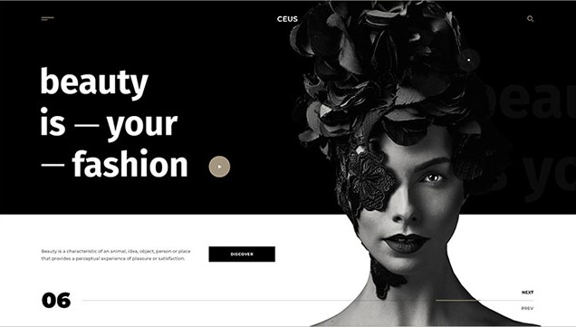
Black and white colour have power- the power to make it bold, simple and classy. You cannot use multiple colours to grab attention, so you need to focus on designs. This colour scheme is attractive and unattractive, both at the same moment, so you have to decide what you want to make out of it. The designer has to extract the best style out of it to make it elegant and expressive. The idea behind the website should be visible in the design.
3D Design UI Trends
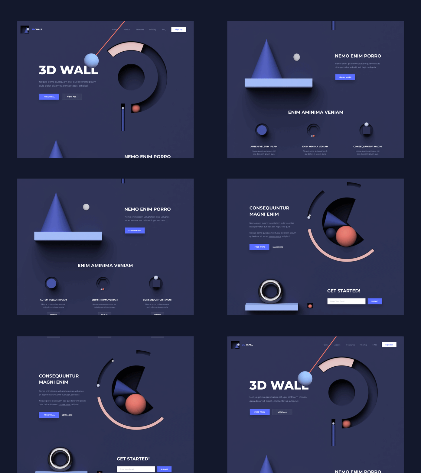
The three-dimensional design of the website is appealing and immersive. People can actually connect to the designs. It includes shadows, animations and layers which adds depth to the designs. 3D web designs are not a fresh concept but this style is creating hype among people. This is going to be the most interactive UI trends of 2022. I have given an example with this video and GIF. The designers have used it in web designing to add as much creativity as possible.
Moving Text Element
This web design is eye-catching and gives the limelight to the keywords. Scrolling text elements, seeking attention, creating impact- it is the goal here. The text should be short, bold, specific and easy to read. Avoid using important informative, contact details, call to action, messaging and social pages in this style. Here the image is static and words are moving. In the next slide, single words are used which have their own meaning. It leaves the bold and strong impact of the text on the minds.
Glassmorphism Design
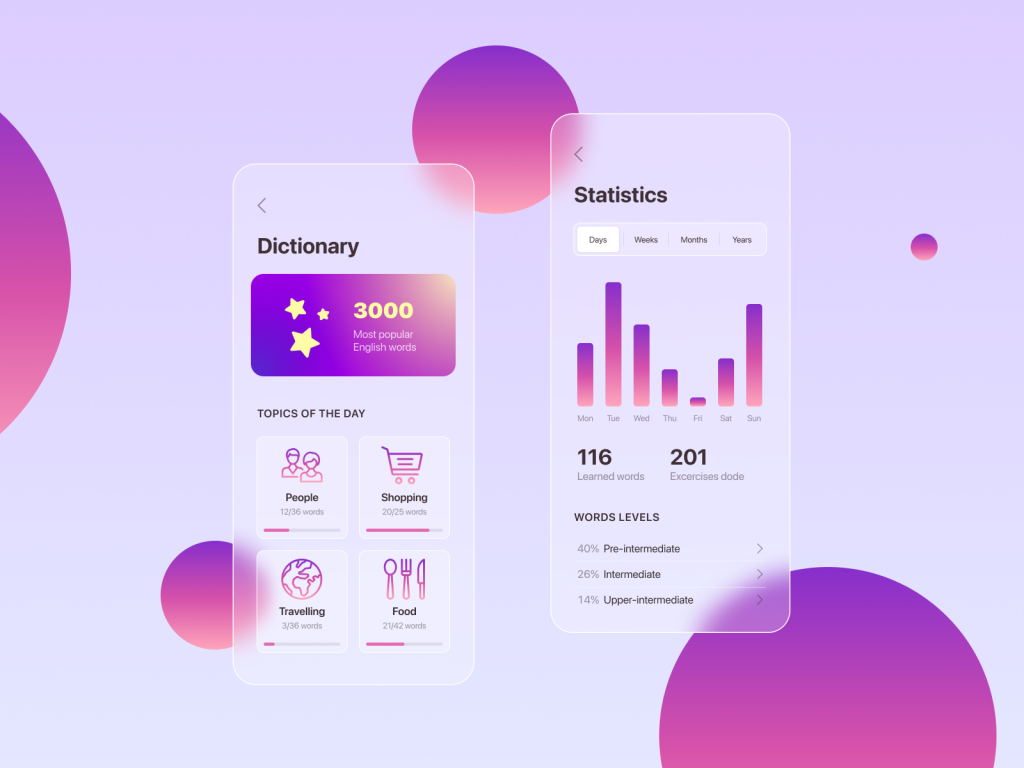
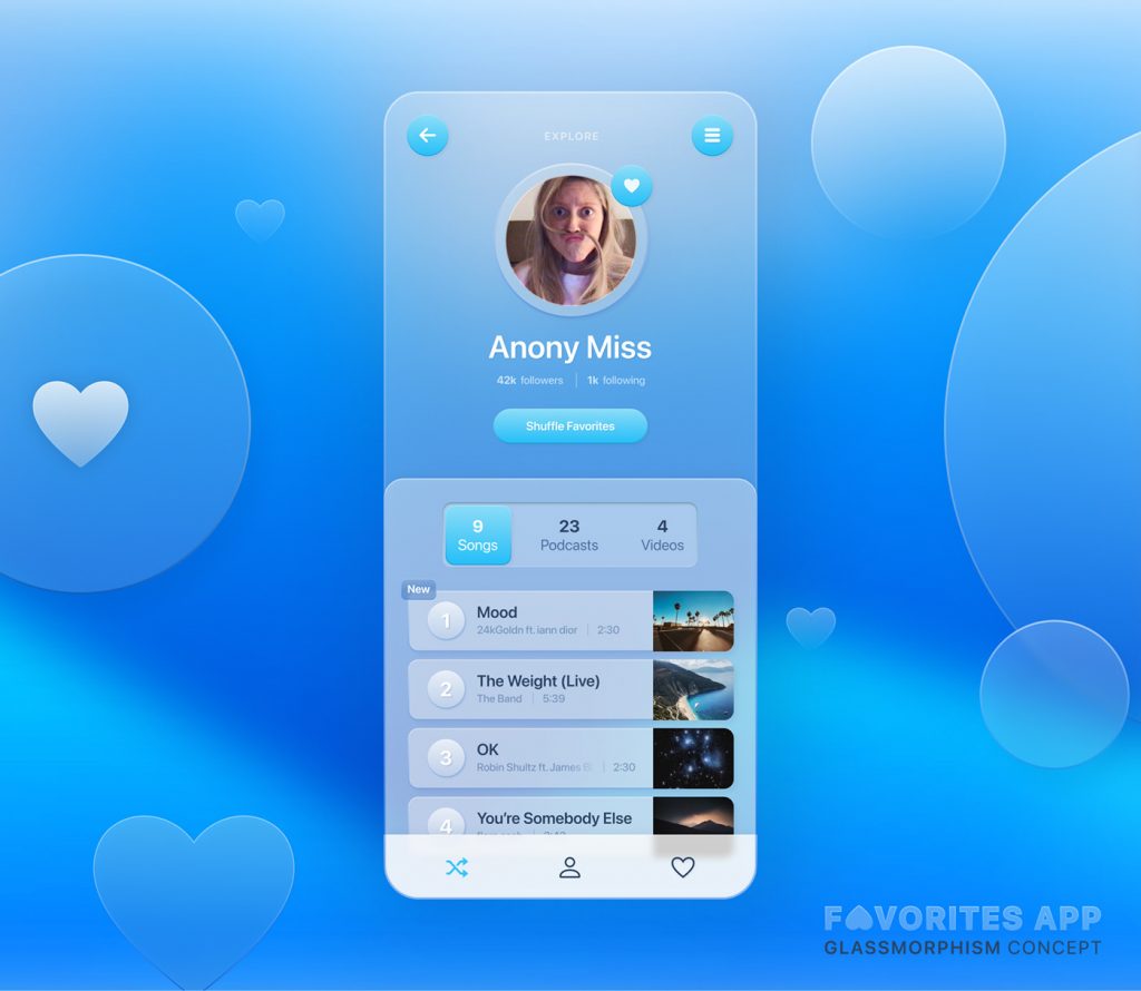
Glassmorphism is a design style that is reminiscent of glass as there are the elements of transparency, frostiness, or glossiness. It was first started in 2021 but will accelerate the growth this year. With the urge of doing something unique, designers are taking interest in it and its usage. I have used these images to explain my point. The designers have used Glassorphism UI trends are usually designed in bright colours and give a crystal-like look. It is one of the best UI UX designs we have.
Layer Effect UI Trends
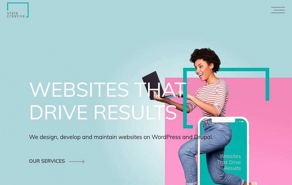
Adding layers to the web design gives the layer effect. Different layers show and cover elements of designs, to make a presentable combination of text and graphics with colours and images. It is just an impressive way to showcase your ideas underneath the design. Bold colours are used to make differences in layers. It differentiates each element from one another to make a comprehensive outlook. Look at these images which I have applied here. It shows different elements highlighting individual layers.
Text-Only Web Design
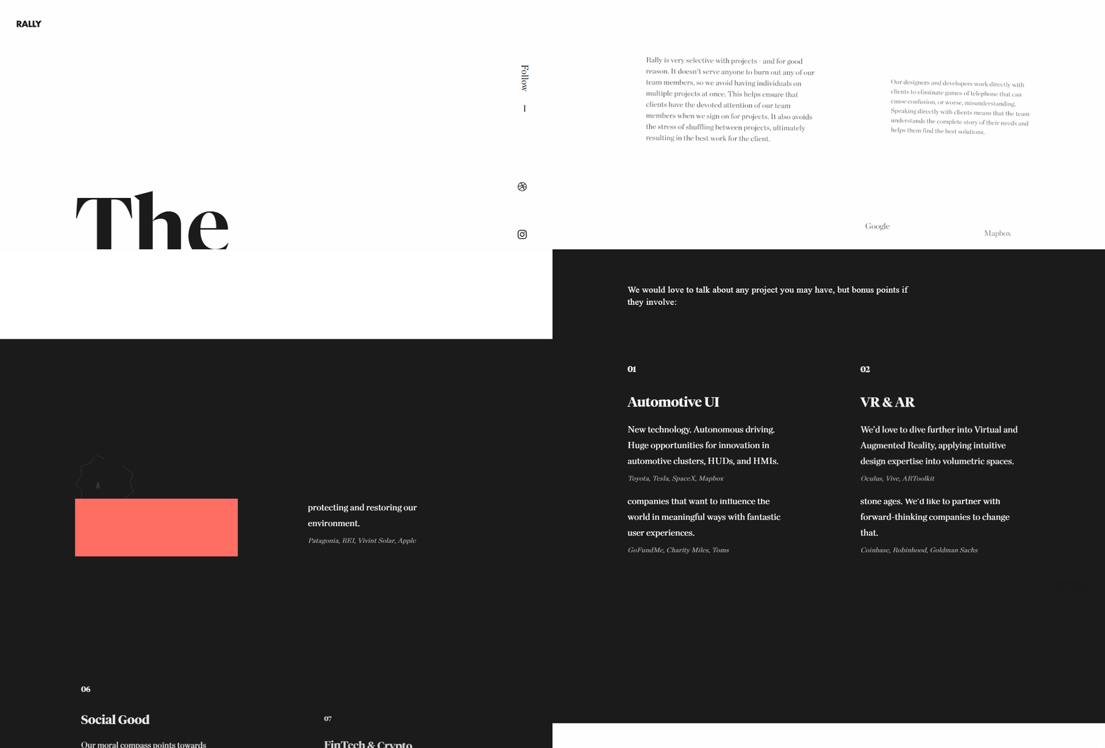
There is no second thought in the fact that images attract the viewers and sometimes words can do this magic too. You need to choose those words and place them in such a way that it grabs all the attention. Over-crowded designs will put the audience away and the entire blank screen will not transfer your idea. So, be selective while deciding the words, fonts, colours and word alignment. If you do not want to use images, then use such colours that fill the missing factors.
Split-Screen UI Trends
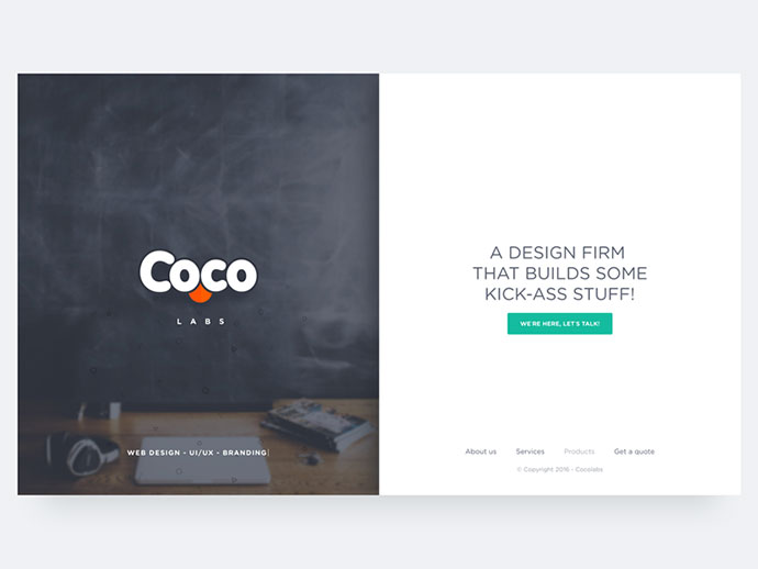
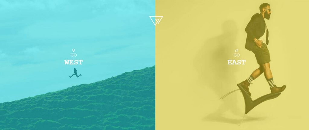
We have been using this feature of the split-screen for a long time now. But using it in website designing is something novel. It gives a strong visual appearance, fits more in less space. Different ideas and different approaches or similar ideas with a similar approach- anything is possible. Usually, designers prefer a pinch of similarity between both screens. The possible approach of a spilt screen could be Text and image, call to action and image, both images. Here, the colour scheme should be smartly planned.
Eye-Catching Website Designs
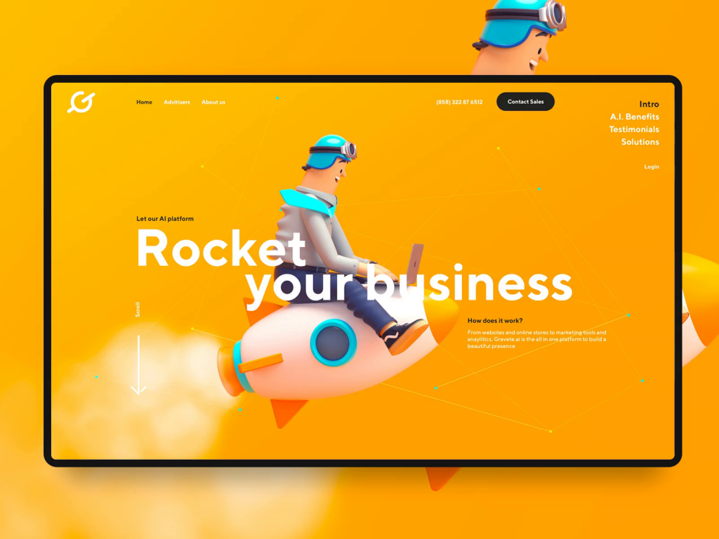
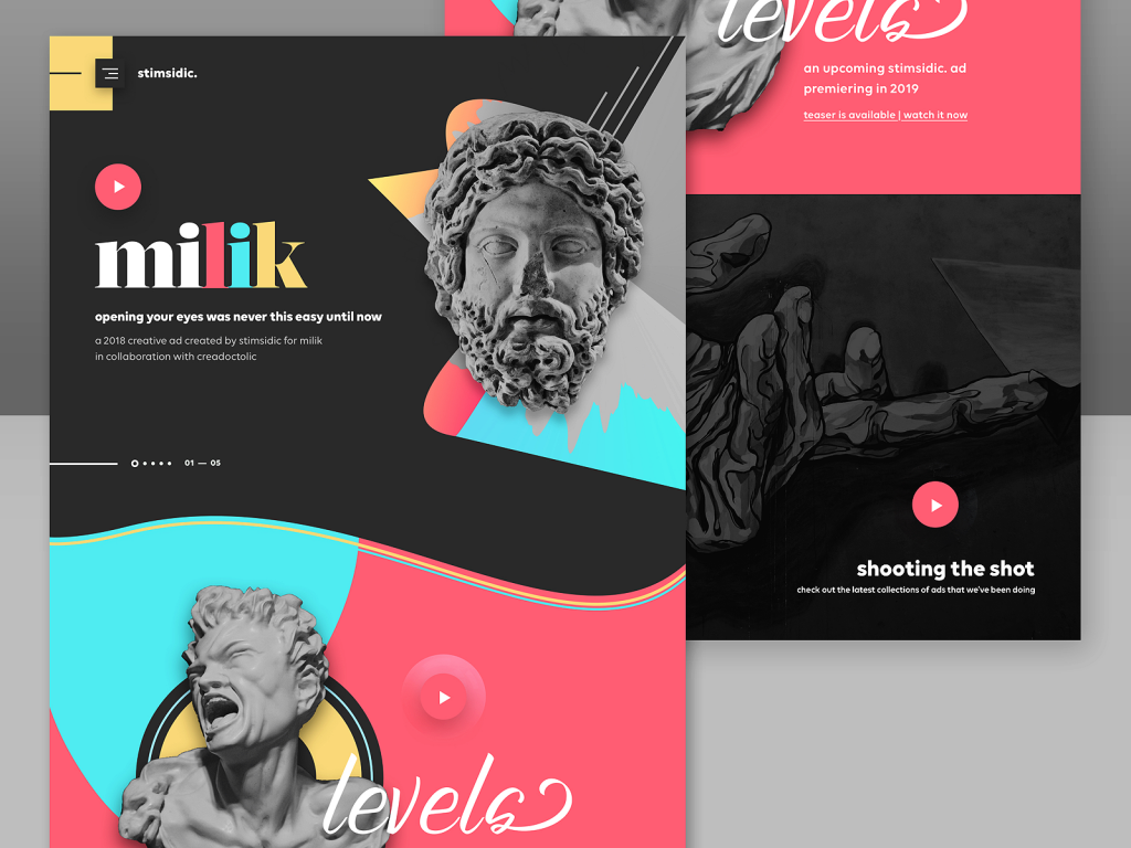
Loud colours, bold text elements, multiple graphics- these were popular last year and this year too, these styles are not out of trend. These funky and eye-catching web designs and UI trends are still in demand in the most attention-seeking way. Choices vary from person to person and designer to designer. People still prefer designs like these because it not only grab the eyes of viewers, it also explains the ideas and vision of the company. The multicoloured web design targets all kinds of audiences and highlights the creativity of designers.
Vintage UI Trends
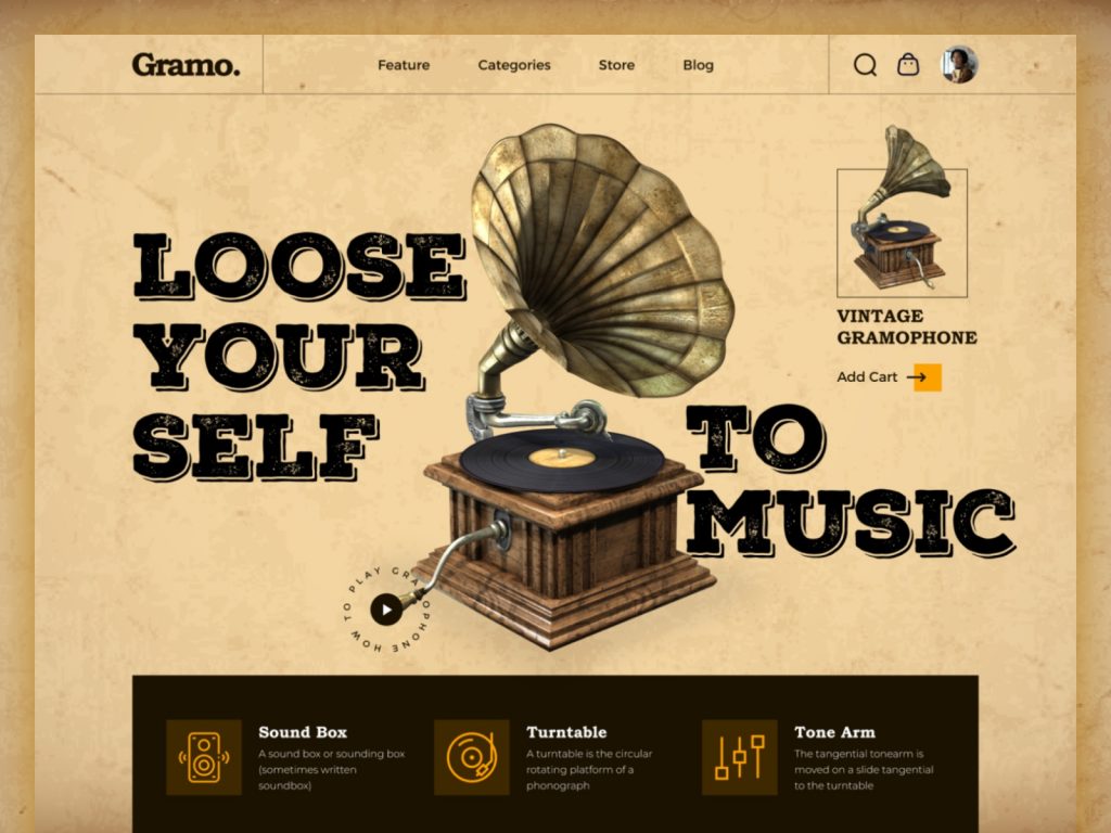
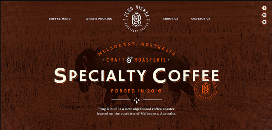
Old is Gold- It is a popular saying which is used to appreciate old products, styles and trends. Check these vintage web designs which look fabulous, even without bold colours. While choosing retro designs, keep in mind that it doesn’t fit every business niche. But whichever business uses these styles will definitely create a noticeable impact. It is quite a task to carry this style perfectly. Retro designs have more text and fewer images. You have to avoid the usage of fluorescent colours.
Motion UI Trends
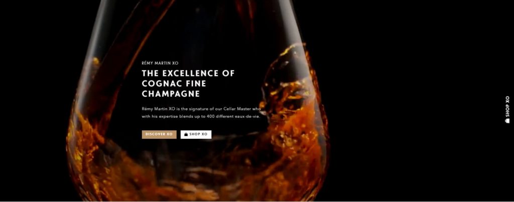
Motion Web designing is one of the latest UI trends where images are captured in motion. It reflects the movement of a particular thing like a person walking, running or wine swirling- like the image I’ve chosen here. People feel more connected to motion graphics and find it more engaging. It is one of the best UI UX designs because the movement has the power of appealing to people to personal levels. The emerging trend of motion in the website designs will increase with each passing day.
Other UI Trends of 2022
- Fun Designs– The super cool shapes and images are used in these designs with bright and appealing colours. The Colour scheme should be good while making it and almost all types of brands can use it. These optimistic designs are eye-catching and powerful.
- Bold Typography– The huge letters grab all the attention but you need to keep in mind that the font should be easy to read and the text should be specific. And also, use strong words which can make an impact on the minds of readers.
- Empty Spaces– You can minimal text or smaller images to make it look neat and empty, the way you like it. Blank space creates focus on main content and elements properly. This trend has quite a demand in the market and people love it.
- Single Page Website– People like to get more in less. No one has time to explore every page and read all the information on all the web pages. People have likely to start preferring single page websites, which allows designers to add all the creativity in one spot. It is helpful and easy to navigate as well.
- Extraordinary Imagery– Over-the-top images on the front page of a website are quite trendy and the reason is very simple- attention-seeking. Broad and unique images create dramatic effects. People like the designs which can blow their minds.
Conclusion
Web designing is something that will keep changing and transforming its appearance with each passing day. To stay ahead of all the trends, you need to know about the UI trends of 2022. I have brought all the information that you need to create remarkable effects. You can get UI UX design services and web designing services for your brand from top web designers in the country. I have mentioned a few of the supreme trends which can make your website stand out from the crowd. Read this article and share your views with us.

